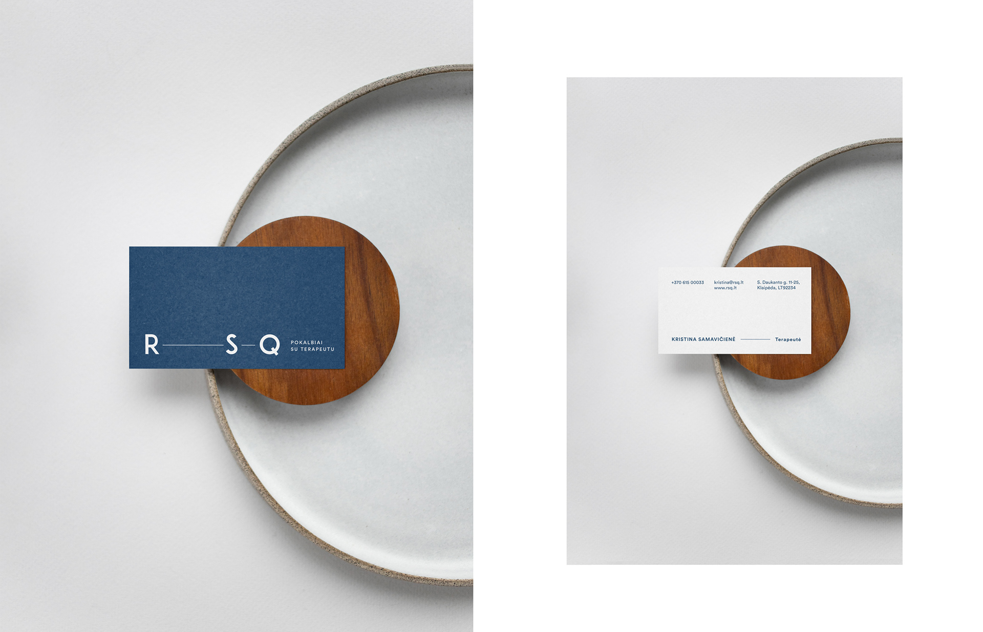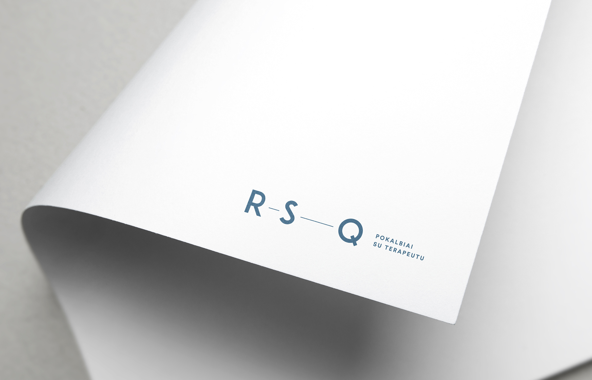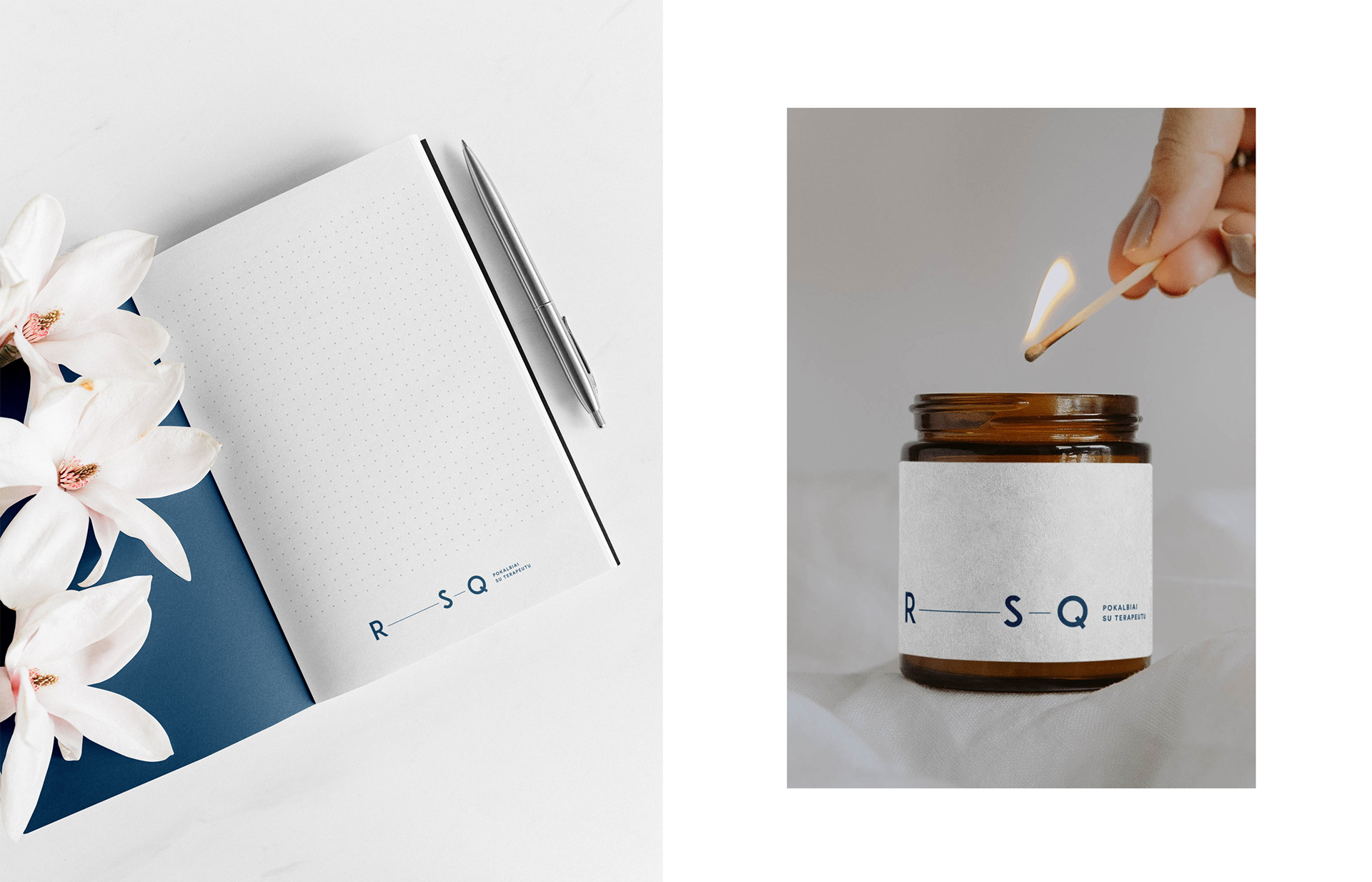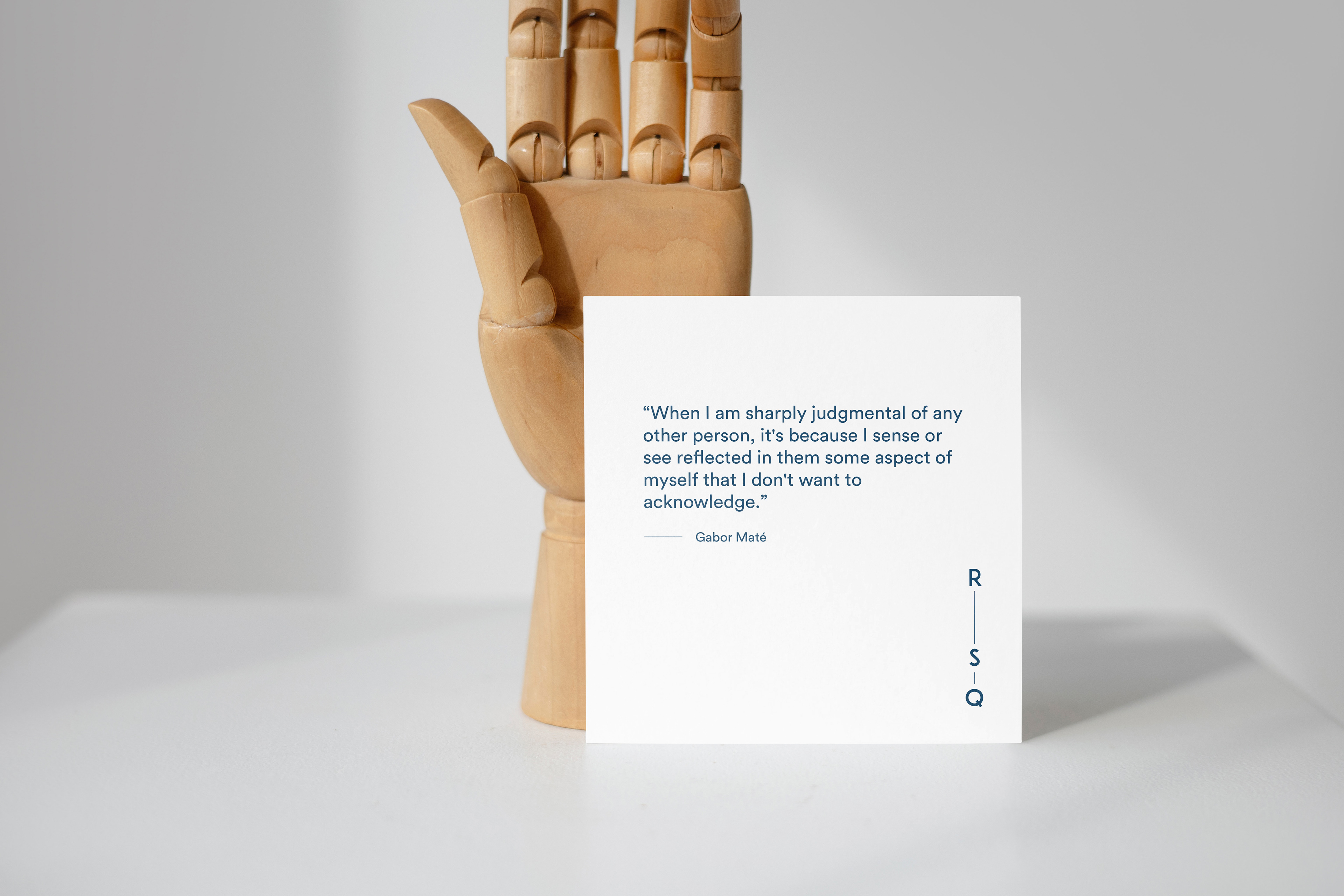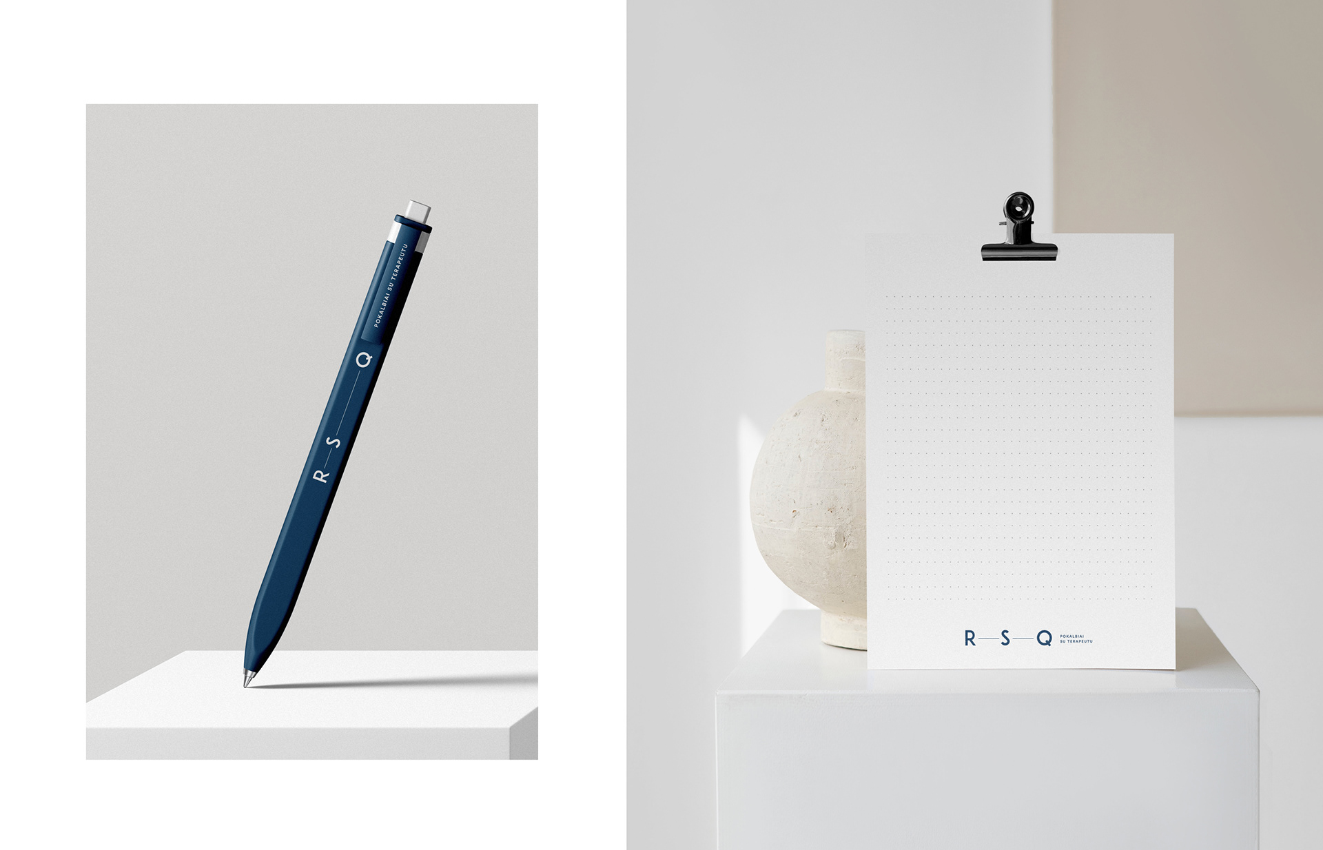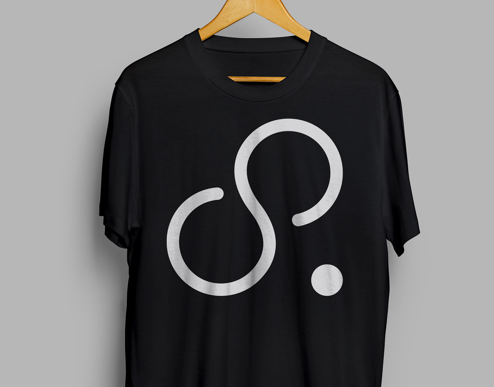
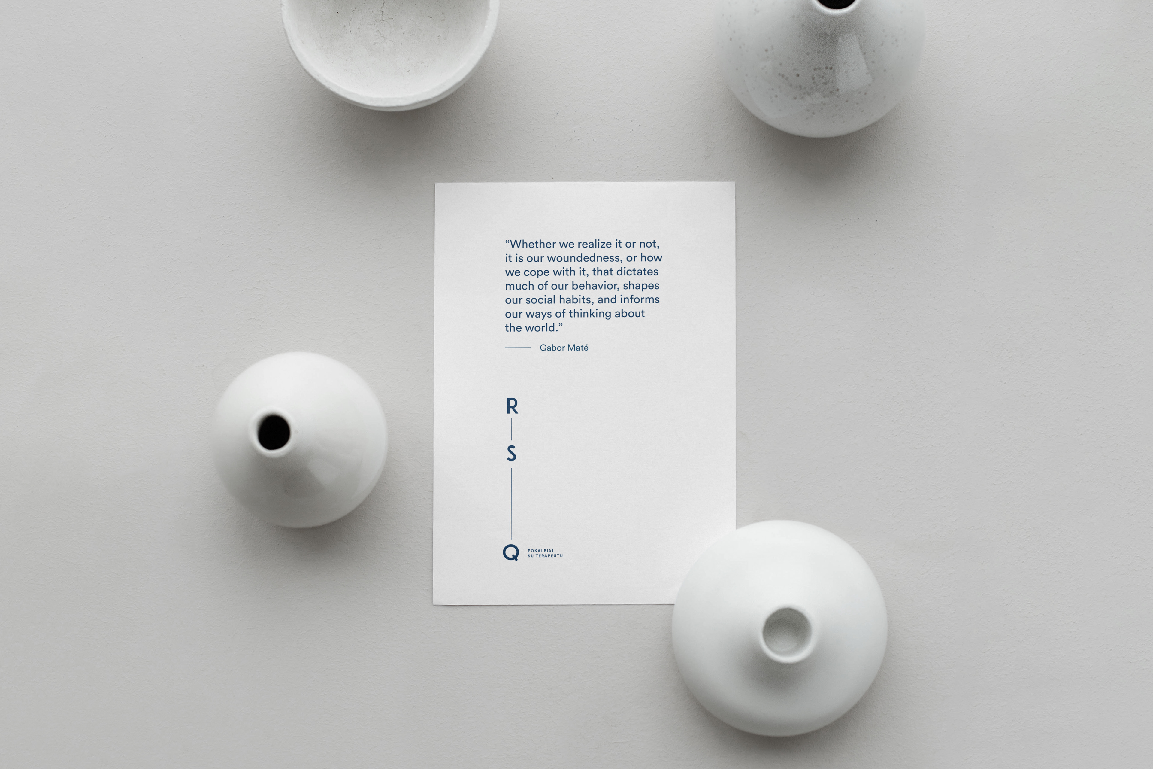

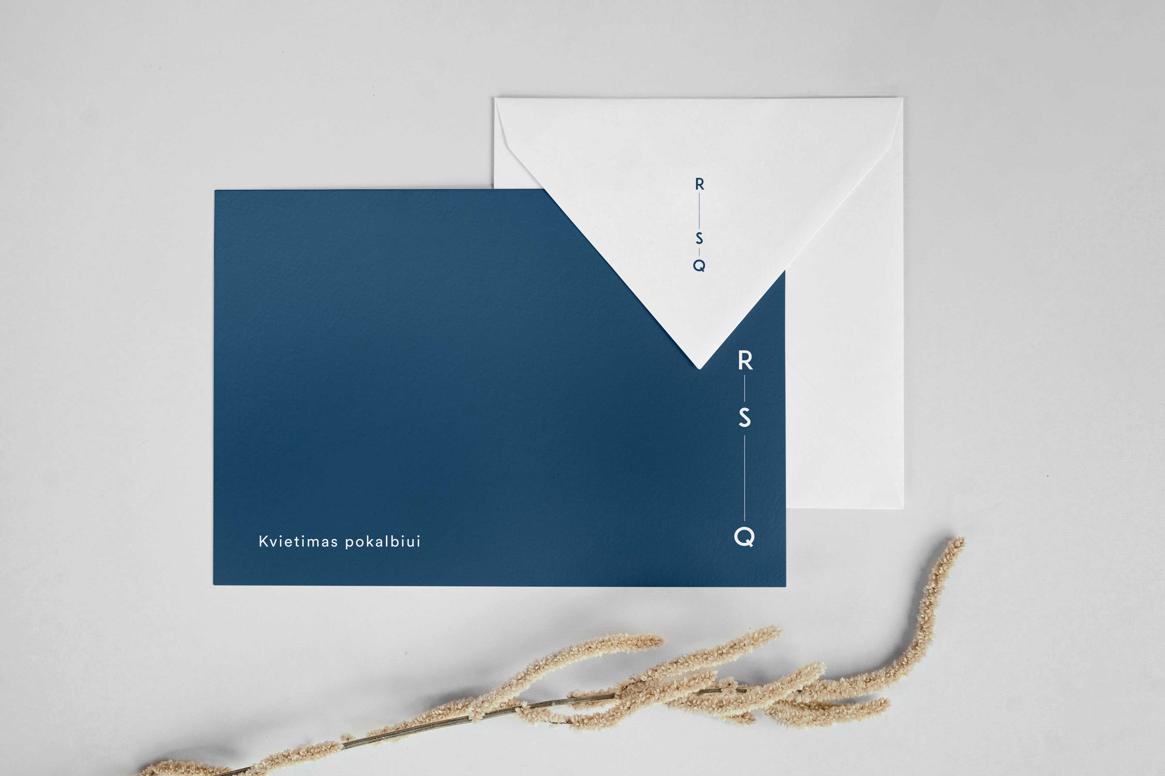
R – S – Q conversations with a therapist
The design of the logo is dynamic and changing: dashes of different lengths appear between the R –S – Q letters, symbolizing conversations with a therapist and the various duration of psychological assistance.
The logo has many possible uses, can be both horizontal and vertical, thereby conveying the message: every person is unique and authentic, so the patient will be given as much attention and time as he or she needs.
Brand colours: deep ocean blue (calmness and depth) and white (lightness, balance).