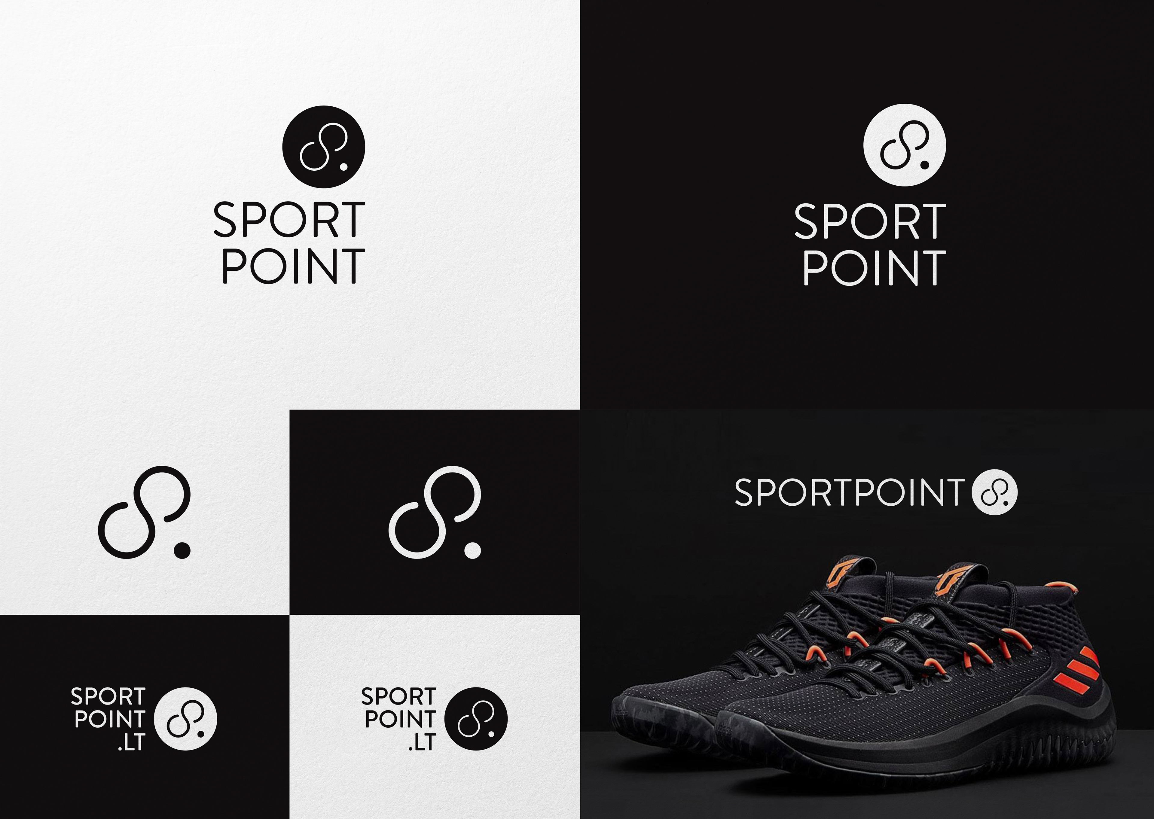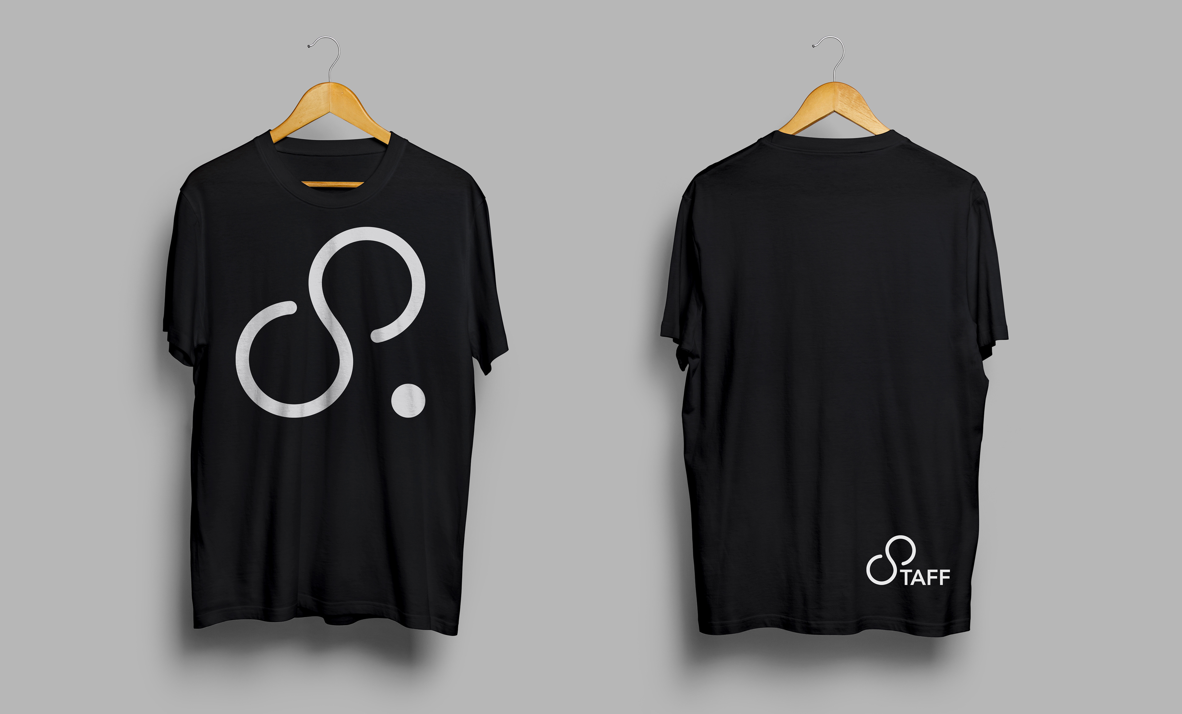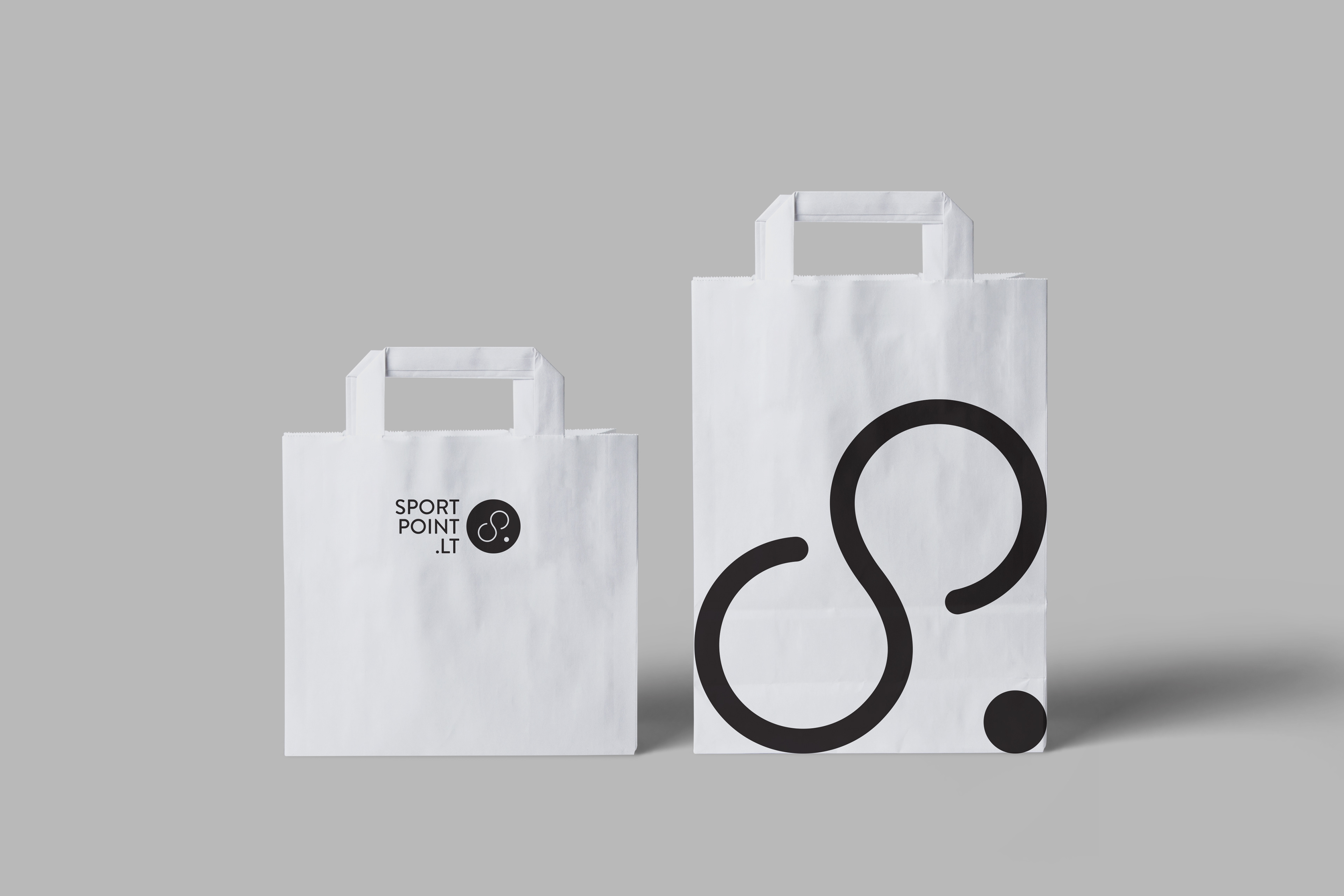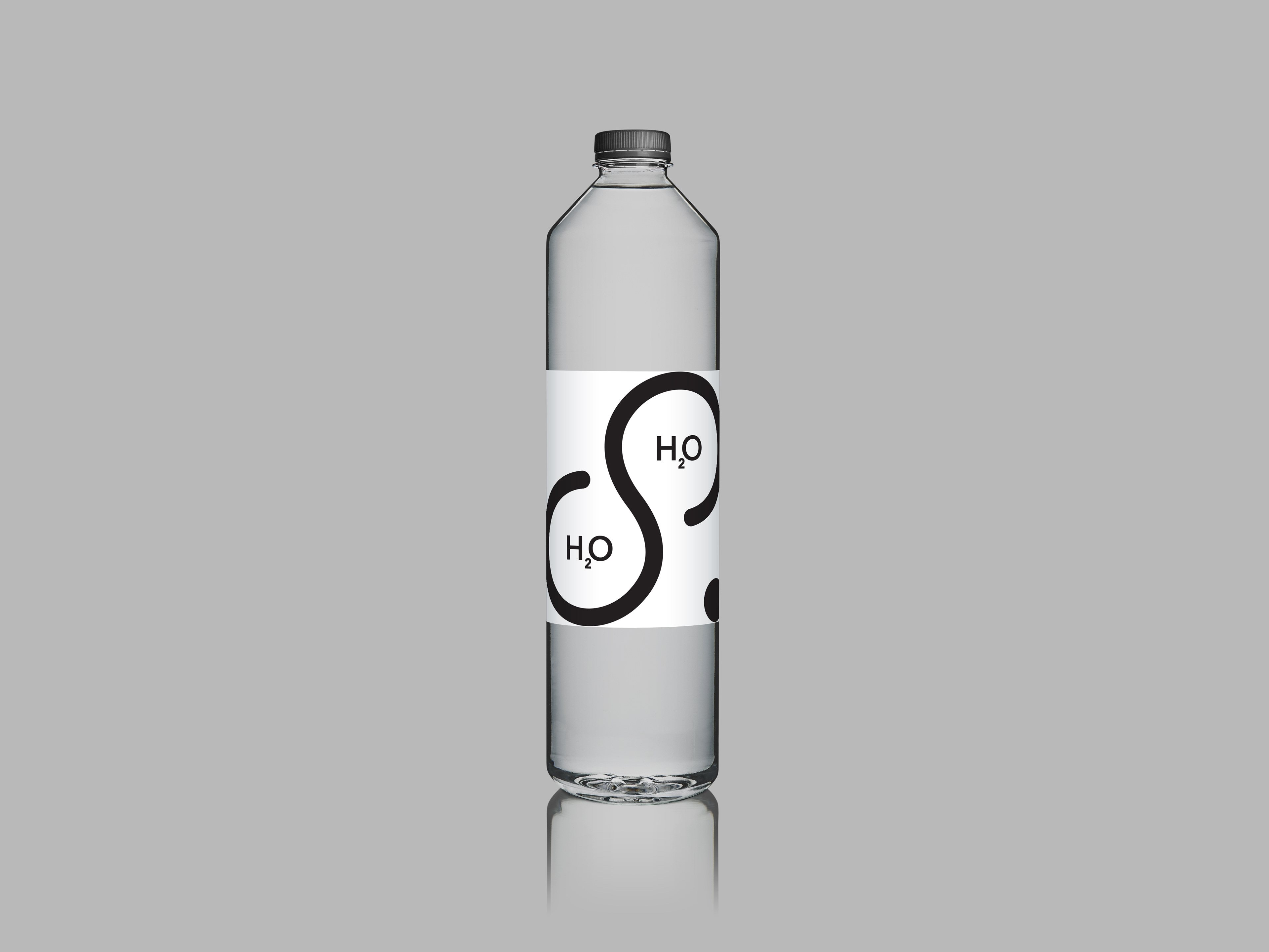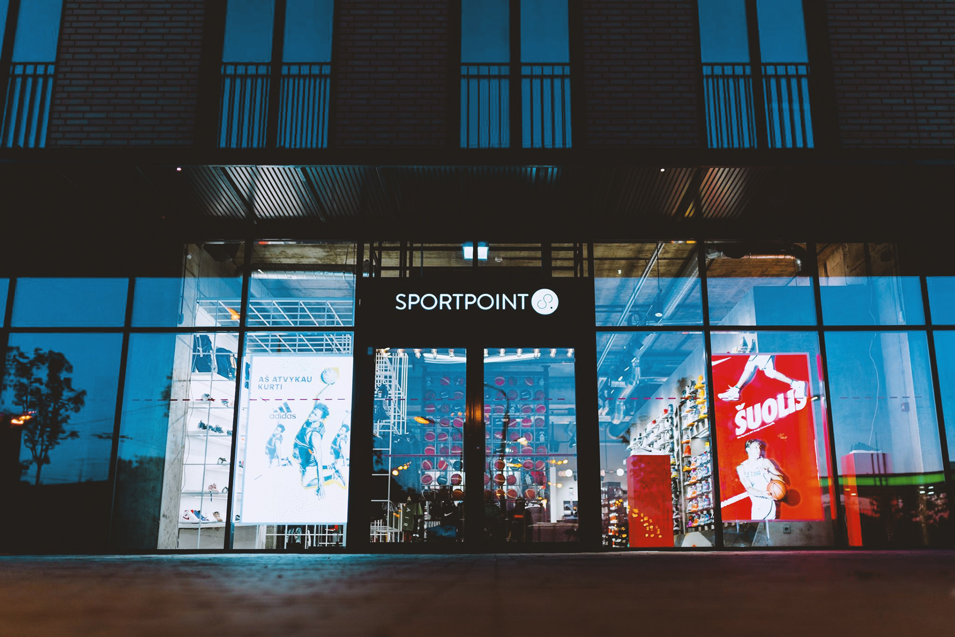
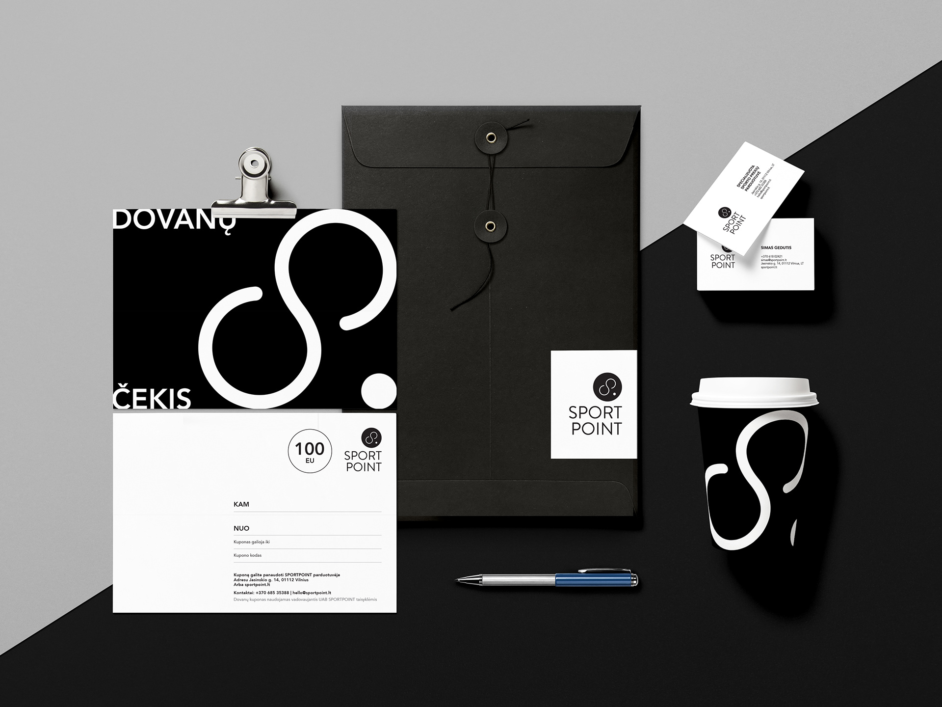
Being active – is not necessarily easy. That's why at least the brands who are working in the sports goods market should make it look easy! The company specializes in basketball and running shoes, so the identity elements represent the same philosophy.
The letter "S" symbolizes infinity and dynamics and its lean angle is not accidental – it reminds human body doing sports or running and the "dot" next to letter gives significant balance and stability to the logotype’s graphic sign. The whole identity is built with the same straight "recipe": B&W colours and the visual sign are in the spotlight.